Clover Moore and the Cancer Centre
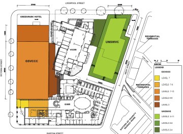
click for larger
You’ve probably seen around the net news that the City of Sydney has submitted an “alternate” plan for the Garvan St Vincent’s Cancer Centre and UNSW Virology Centre in Darlinghurst, Sydney. This is an area familiar to most Sydneysiders as one happily littered with small houses and eateries. The CoS thinks the new buildings are too big and are advocating that they be made smaller by leaving out the UNSW Virology Centre and stepping back a lower Cancer Centre from the street frontages.
The BVN design for the Garvan Institute is admitedly massive for the site and locale. There are no available architectural renders for the Daryl Jackdon + Robin Dyke UNSW Virology Centre, though it looks pretty bloody big in the massing model further down.
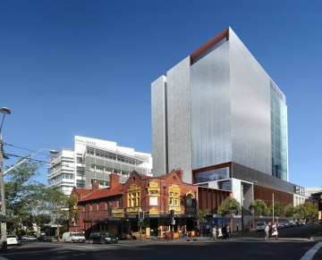
BVN render from Victoria Street – North.
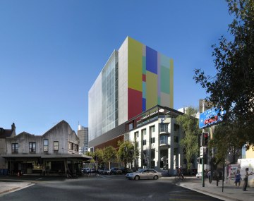
BVN render from Victoria Street – South.
Councils are normally hamstrung and hand-wringing in such situations, as the approval for major projects comes not from them but from the state government. Still it is unheard of (I may be wrong) for a council to submit an alternative proposal.
Lord Mayor Clover Moore has spoken out about the designs, saying they disobey a 2005 masterplan, are excessive, have too many carparks, and fail to meet sustainability benchmarks. The CoS submission states that the overshadowing diagrams “lack credibility”.
Massing montages of the West Street proposal for the UNSW Virology Centre follow.
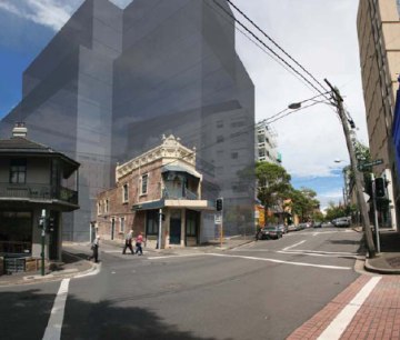
Urbis + DJ massing model from West Street.
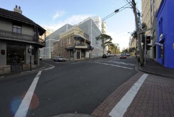
CoS’s prefered mass from Victoria Street.
View Larger Map
What’s there at the moment.
Looking at the apparently credibility-lacking shadow diagrams, I wonder how BVN could have made them any harder on themselves. Here is the June 21 9a.m. diagram, casting shadow over a cafe-strewn area currently bathed in morning sunlight.
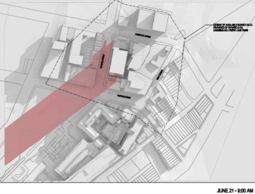
BVN shadow diagram drawn 24th April, 2009.
The following is from the series that Clover believes lack credibility. The orange smudges represent new shadows, and are pretty thin on the ground. The sites slope to the East and there are other tall buildings in the vicinity, so it is hard to verify the diagrams. But why would they be faked?
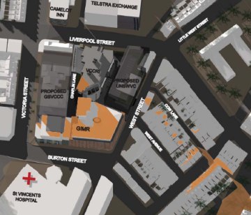
Urbis shadow diagram for both buildings, June 21, 3p.m.
Arup’s ESD report for the BVN proposal ( PDF ) is dotted with escape phrases such as “will consider” and “will investigate”, but does (more or less) commit to being in the top 25% when gauged against the American Labs 21 benchmark. It doesn’t refer to any particular architectural innovations on the ESD front, but perhaps that is a big ask of a tightly-packed laboratory building.
Please comment below if you know anything more or have an opinion on this complex affair. Should St Vincents be allowed to gobble up Darlinghurst or should new buildings step down to a scale more in tune with the neighbourhood? Has Clover stepped out of bounds, or did someone need to? Should the architects just fill the envelope given to them, or question it?
Posted by Peter on 30.08.09 in buildings and planning
tags: bvn, city of sydney, clover moore, hospitals, labs21
comment
As a non architect, I dislike the idea of councils or politicians commenting on work that is not designed for or paid for by them. Councils restrict new design enough- any more and there will be no innovation. We’ll end up with bland boxes that fulfill size criteria, and hide from their surroundings. But in Darlinghurst etc the surroundings are not that great- the “heritage” is really just old- so some change would be welcome?
by will on 31 August 2009 ·#
The practice of councils doing their own work is more common than you would think. I was the Senior Urban Designer at the CoS for 3 years & when there are the resources to do this, councillors feel more empowered to push against proposals that are submitted by applicants. I’ve also had councils commission other architects to come up with alternatives for my own design work (Hunters Hill) which I find an even greater irregularity. There is a great deal of suspicion about the accuracy of design proposals especially when it comes to mass and sun-shading impacts. Sometimes its warranted but mostly its designed to give the politicians some leverage over the work & be seen to be actively meeting their constituents’ interests. What is discouraging is that the people making these critical assumptions are working to a reactive political framework rather than one that is design led.
The first picture looks uncannily similar to the new Myer building at Melbourne Docklands. Then the second photo looks like it accidentally collided with Hosies Hotel. 1950s architects would be immensely satisfied that their somewhat ideas are being resurrected half a century later.
I think it is fine if council’s put up alternative proposals if it adds to the debate on a contentious development. In this case there was widespread community opposition to a massive building that materially impacted the adjoining urban environment. The proposal violated an earlier masterplan that the community had pushed for to get certainty over development forms – and which was presented to the community but was not submitted for approval with the State government. The end result is a hodge bodge of buildings with massive density, poor intergration with adjacent areas, and significant environmental impacts. The CoS proposal highlighted an alternative that needed to be articulated on behalf of the community given the tick a box approach to community consultation adopted by the applicant.
by Blake on 22 December 2011 ·#
Commenting is closed for this article.