home » news » competitions » New Zealand » Auckland
Queens Wharf
233 entries were received for the “ideas” component of this Auckland competition for a cruise terminal and event space on an important waterfront site. They can be viewed online in a pixellated sort of way (even if you download the “high res” PDF.
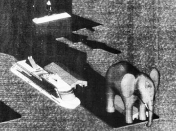
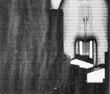
Quality varies wildly. Many, many entries thought the best approach was to place a BIG SYMBOLIC THING on the wharf. So we have cruise terminals wedged into.. a taniwha, korus, a conch, wakas, pebbles, stones, upturned dinghies, rugby balls, sails (lots of them). Strangest big thing would have to be the baby elephant, street elevation is of Dumbo’s posterior (below). There is a small note that the intended colour is off-white. Get it?

Entry 029 – street elevation

Entry 029 – street elevation
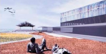
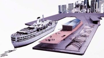
Something a little closer to the brief.. Can’t say a lot about it as the description is pixellated. It combines several common traits in the entries – by addressing the nostalgia requirement (12MB heritage assessment), a landscaped building element (hello Yokohama ), and consideration of the function of the wharf when the ships aren’t there (about 9 months of the year).

Entry 024 – view to the sea

Entry 024 – bird’s eye
Posted by Peter on 13.09.09 in competitions
comment
Commenting is closed for this article.
