home » news » galleries » Australia » Victoria
Gallery fatigue
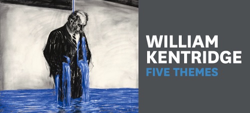
I finally got to the William Kentridge exhibition at ACMI last weekend, with a friend. It closes at the end of May. It is worth every cent. Etchings and drawings of characters in his films take up most of the space. He has a particular way with blotchy skin that reminds me of the late Lucian Freud’s work. The self portraits – William as “Felix” and “Solo” – move about within ghost like bubbles that remind me a bit of one of Freud’s models, Sunshine boy Leigh Bowery.

So the traditional hung paintings sat well in the gallery, with lots of room to pace about and stand back without getting in anyone’s way. The film spaces were such a let down in contrast. My memory fails me as to whether it has always been like this. Perhaps it was just the volume of people highlighting the deficiencies.

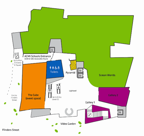
[ACMI Flinders Street level – the main entrance has been relabelled Video Garden..? MORE PLANS]
Some suggestions we came up with afterwards, for those lucky enough to be designing such space, and their exhibitions.
- small theatres work for a few people, but they need to have a way to cope when a few more arrive. One seat holding at most five people doesn’t cut it when the viewing time is over half an hour. Elderly people were sitting on the floor. Why not an inconspicuous bench around the perimeter of the room?
- for some reason Kentridge’s work had been digitised. I guess it has to be to run on a loop. The rooms were so shallow though that it was too easy to see the pixels on the screen, and in one older video, an awful lot of colour artefacts (smudgy bits). We come to view video here rather than on Youtube for the quality, so it is disturbing when you can get a better result (and distance) on your home screen.
- the theatres have no doors on them. I suppose this has something to do with enticing people in and providing them enough light to sit down. Instead, gaggles of people just stood in the doorway.
- two of the theatres are adjacent. Sound travels, especially when there are no doors and a lack of acoustic insulation.
- show starting times and durations on the doors to the theatres. We entered half way through both films and had no idea how long the loop was. People can’t pace their visit if they don’t know how long things are. Some people like to watch films from the start too.
- having sat uncomfortably in the two theatres for over an hour, we were exhausted and had to leave. This meant we had to forfeit the rest of the exhibition. Gallery fatigue is real, so why not provide pass outs?
- ease off on the surveys. One at the bottom of the “out” escalator, and another at the top. I was identity-stripped. I was expecting to be asked about my visit, but they were more interested in my income level and postcode.
- The new and revised ACMI has no access from Flinders Street. Why shut the front door and force people to enter from the Square? The ACMI layout has been fiddled with since it opened. The organisation has grown significantly and has many separate functions on four levels. Why does it need to occupy a cul de sac? No one can just drift through as we could when it opened. That was great, it was surely useful to ACMI, and it was also an integral arm of Federation Square’s meandering circulation system.
[ Lucian Freud’s portraits are currently on exhibition at the National Portrait Gallery, London ]
Posted by Peter on 10.04.12 in galleries
tags: theatres
comment
Commenting is closed for this article.