A sentiment in a minor key
The Palace of Fine Arts in San Francisco is out of the way now, sandwiched between The Presidio military barracks and a residential neighbourhood. It was out on the edge because it it sits on what used to be the swampy 635 acre home of the 1915 Panama-Pacific International Exposition (“The Innocent Fair”). There’s little left to see of the buildings that made up the expo, but it was well-documented – here’s a good glimpse showing the Palace in construction.
PPIE 1915 documentary (11:52 for The Palace of Fine Arts)
All up the fair cost fifty million U.S. dollars (about $1.15B in today’s dollars). Its centrepiece was the Tower of Jewels, covered in 125,000 shimmering Bohemian glass jewels fixed to mirrors. Highlights were the auto assembly plant presented by Henry Ford, and Thomas Edison’s light shows. And then there was The Palace of Fine Arts. It’s a complex that in a functional sense housed an art exhibit, but to Bernard Maybeck it was a carefully-engineered emotional procession.
The commission for the Palace originally belonged to architect Willis Polk, but Polk put Maybeck forward in his stead. Perhaps this was an example of the gallantry of a time past, or the pragmatic solution of a busy man (Polk was chairing the architectural commission for the entire fair). However the job came to Maybeck, he took great care to address Fine Arts director John Trask’s vision. The brief spoke of the mood required for a building housing fine arts in the midst of a noisy and colourful world’s fair, and Maybeck responded.
“The Fine Arts suggest the romantic after the classic renaissance… These nomenclatures, ‘romantic’, ‘classic’, etc. are usually covered by the word ‘atmosphere’… For instance, when [Trask] said that he did not want the visitors to come directly from a noisy boulevard into galleries of pictures… Mr. Trask not only wanted the mind of the visitor to be in a tranquil mood, but he worried lest the high coloring on the outside of the building would dull the eye of the visitor to the delicate tones and shades of some of the pictures.” Bernard Maybeck
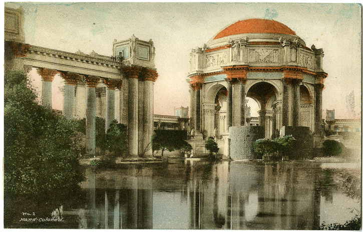
Source: Berkeley EDA
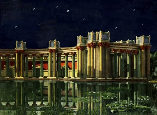
“high colouring”
“Summing up my general impression, I find that the keynote of a Fine Arts Palace should be that of sadness modified by the feeling that beauty is a soothing Influence.. To make a Fine Arts Building that will fit this…impression, we must use those forms in architecture and gardening that will affect the sentiments in such a way as to produce the same modified sadness as the galleries do… you examine a historic form and see whether the effect it produced on your mind matches the feeling you are trying to portray…a sentiment in a minor key.” Bernard Maybeck
His inspiration for focusing on emotion seems to have been drawn from a visit to a gallery in Munich. Having “dragged” himself past a great variety of artworks, he emerged into the sunshine. “All at once our eyes fell on the marble bust of a five-year-old boy cleverly portraying a little mischief, and underneath the bust were the words, “Dear God, make me pious,” – and we smiled.” He noticed the “drawn” expressions of other exiting the gallery and how they relaxed into smiles upon seeing the bust. “We realized right there that an art gallery was a sad and serious matter.”
Same for the surrounding lake. Maybeck wanted something that was a little less dismal than Böcklin’s Isle of the Dead series, and found it nearby at Clear Lake, “where the trees and bushes seem to rise out of the water.” This choice also may have helped his design fit into an exposition that he believed expressed California. Emotionally, the colonnade and lake were hoped to be a kind of decompression chamber for those leaving the “strain of the galleries”, before reentering the “hustle and bustle” of the fair.
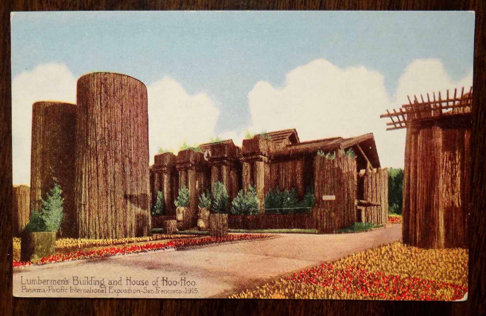
Maybeck wasn’t quite as expansive about another building he designed for the Fair, The House of Hoo Hoo. Much lesser known than the Palace, the House of Hoo Hoo looked like a South Seas tiki lounge crossed with a Franciscan Mission temple. It did share some similarities with the design for the Palace of Fine Arts, particularly in its planter-topped pediments – though at the Palace the plants were pulled for budgetary reasons. This must have been a great disappointment to him, as it seems quite intergal to his vision of the colonnade as a ruin, being overtaken by nature.
It’s reasonably safe to say that the Palace of Fine Arts was the most popular building at the Fair, and was of more note that the art (“ancients and moderns”) housed within. But it had definitely not been built to last… built of timber framing coated in staff, it had a life expectancy of two years. Even while the exposition was still in progress, efforts began to preserve this peculiar fusion of Greek, Roman, Baroque, and.. Maybeck, for the long term.
When the exhibition ended in December, most of the buildings were torn down. There wasn’t much holding them together so that wasn’t hard. Bernard Maybeck made an unusual request around this time – that his attempt at a melancholic, Piranesian palace of ruins should be left to become an actual ruin. But by then the Palace was pretty much assured of some sort of preservation – while the Exposition was running a public fund was launched to preserve the buildings and lake. In 1917 Assemblyman Milton Marks introduced a bill aimed at preserving the Palace. It would be the first of many attempts by Marks, Caspar Weinberger, and many others, to save it. But it was to be a while before anyone came to rescue the Palace, so Maybeck’s wish came true and it began to crumble. If that really was Maybeck’s wish…
Contemporary correspondence with Walter Burley-Griffin, who was toiling away on Canberra town, reveals a different, canny Maybeck. He suggested to Burley-Griffin that building in cheap lightweight materials is a cunning way to encourage funding for a more permanent version. Research by Gary Brechin has unearthed Griffin’s resigned response.. “plaster or stucco are hardly considered as temporary expedients [in Australia] for they are largely employed for buildings both commercial and governmental, already deemed to be permanent.”
It is tricky to work out quite what Maybeck thought of his buildings at the fair – his explanations over the decades weren’t exactly consistent. In an interview with Ben Macomber at the time of the Exposition, he hinted that the public were intrigued by the Palace not because of its architectural mastery… more like its old tricks.
“What is it the people like?” he asked, and himself replied, “it is the water and the trees.” When I reminded him of the beauty of the colonnade seen from points in the enclosed passageway, where no water is in view, he answered: “The public was bribed to like that. Leaving off the roof between the colonnade and the gallery was a direct bribe. A few other simple devices give the effect the people like. One of these is the absence of windows in the walls, a device well known to the old Italians. Others are the water, the trees, and the flower covered pergolas on the roof.” The Jewel City
Two decades after, Maybeck and White returned to the Palace, spending $500,000 in city funds on preservation. The US army also worked on it during World War II. In the following two decades, while discussions swirled about the future of the Palace, the buildings themselves were left to rot again. After reading about the building’s fluctuating condition over the decades, its hard to believe that it received much in the way of maintenance.
There were numerous suggestions put forward for the buildings, including a rather unpopular one from the AIA in 1952…
“The Northern California Chapter of the American Institute of Architects prepared a report… recommend[ing] that the Rotunda and Colonnade be torn down, and that the exposition hall at the back be repaired for modern use. (The estimated demolition costs were $50,000; the estimated repair costs were $1,000,000.) The lagoon was to be saved, and modern sculpture placed about it. This report which reflected the crass business-esthetics of most practicing architects was later repudiated by certain members of the committee.” National Park Service 1964
In 1951 Maybeck was awarded the AIA Gold Medal. He was entering his Nineties but still contributed to the discussion about the Palace. By then he was saying that if rebuilding was to occur, it should be in Golden Gate Park, the original location intended for the Exposition before it was relegated to swampland. Maybeck died in 1957 at the age of 95. The following year the Palace was still looking good from a distance in its brief Vertigo cameo, but up close it was a different story.
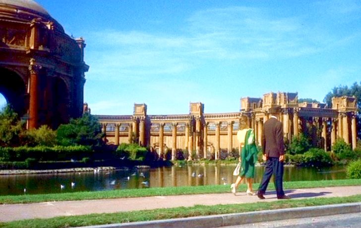
1958: Alfred Hitchcock’s Vertigo, still via Lady Eve
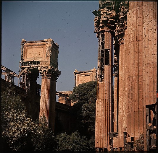
1960: Walter Evans
Photographer Walter Evans visited the site in 1960. The cheap staff stucco cladding was breaking off exposing the framing, and the artifice. Evans’ photos were part of a giant set he took of “doomed architecture”, commissioned by Time-Life (the entire collection can be viewed at The Met’s online archive ). It was possibly this exposure, and not-too-distant memories of the Exposition, that helped build the momentum for preservation. The nine page feature also alerted New Yorkers to the imminent loss of Penn Station, but it was too late to save that.
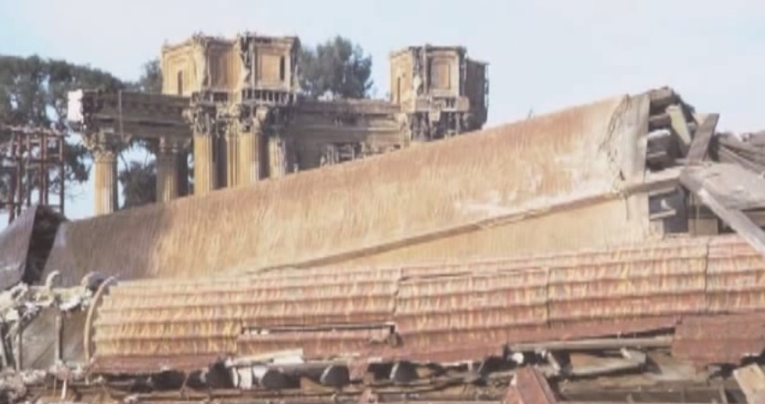
Funding uncertainty continued right into 1964, the year the Palace was demolished and rebuilding began. The architect in charge was to be William Merchant, who as a student in Maybeck’s office designed many of the plaster details for the Palace. But he died, not long after all his ornamental moulds for the Palace had been unthinkingly destroyed. The project passed on to Hans Gerson.
A cursory look at before and after photos reveals a number of differences between the original and the facsimilie, especially the loss of the unadorned half-round walls at the water’s edge in front of the rotunda. It looks paler too, cream where it should be “high colour”. Critical opinion, personified in Ada Louise Huxtable, was not on the side of the recreation. She wrote of the loss of, “the integrity of a work of art as expressive of its time, the folly of second-hand substitutes for first-rate inventions, the aesthetics and ethics of duplication measured against creative art.” Criticism is expressive of its time too. I wonder how she would have reacted if she’d heard of Maybeck’s letter to Burley-Griffin half a century before, in which he suggests that an original can be a cheap prototype, luring funding for its reconstruction in proper materials.
By the 21st Century the Palace was again ailing, again in need, and again rescued. A major nip and tuck was completed three years ago, costing about $21M. Judging from Google Images, this could easily have been funded by a levy on wedding photographers using it as a backdrop.
So we’re left to celebrate the centenary of a building that is an approximate replica of a ‘ruin’ that became a real ruin 50 years ago. There’s a tangle for you. The lightweight materials were replaced with reinforced concrete, joints visible. It’s sturdy, but still not the stone it was never meant to be.
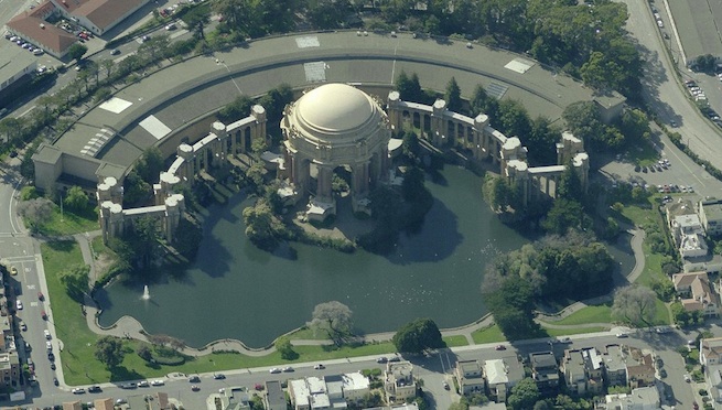
Bing Maps aerial view 2014
References
- Maybeck, Bernard, Palace of Fine Arts and Lagoon
- Library of Congress, Historic American Buildings Survey Palace PDF
- The Met: 439 Architectural Views for Time-Life Project Doomed Architecture
- Uni Berkeley Archives
- Macomber, Ben, “The Jewel City”, 1915. Web
Posted by Peter on 19.06.14 in buildings and heritage
tags: 20th century, 1910s, bernard maybeck, expositions
comment
Commenting is closed for this article.
