home » news » education and heritage » Australia » Victoria
Fait accompli?
In late July the University of Melbourne signalled its intention to “retire” many 20th Century modernist buildings at its Parkville campus before 2040, in keeping with its “long term strategic, academic and research ambitions”. Renderings in its new master plan show the Raymond Priestley administration building, the medical building and the John Medley building tagged for demolition, to name just a few.
Time poor? Skip to the list.
Who has been involved in the development of the Estate Master Plan? An 18-month consultation process has been undertaken involving a cross-section of the University community, including staff and students.” Estate Master Plan FAQs
I’ve yet to find trace of anyone who has been consulted. It was news to the student union, the teachers union, the occupants, even to on-campus architects. The renderings just arrived in the inbox, fait accompli. It looked done and dusted.
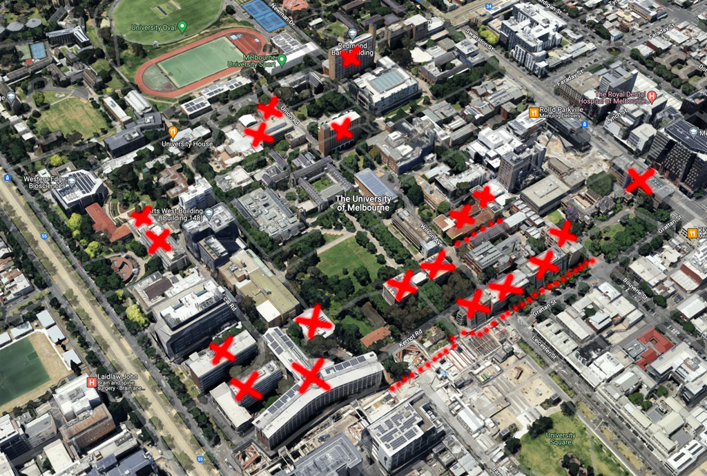
I’ve heard people say, “but it’s just a masterplan, it mightn’t happen”. But it is quite likely to, and the fact that these buildings and spaces are all now queued for demolition makes them less likely to be maintained, repaired, or considered for adaptive reuse.
The new Estate Masterplan is heavy on graphic design and motherhood statements but light on detail, skipping right on to the renderings by Hassell. Many buildings have disappeared, leaving flower beds and bland glass boxes in their stead, all looking a little too realistic for a master plan. The plan’s file name includes the word “brochure”, suggesting that it is not the plan itself, but a summary for public consumption.
Hassell’s project web page doesn’t give much away either, but does hint at why only post war buildings are in the cross hairs. All the renderings focus on Grattan Street, which will become a parkway, “binding the historic northern precinct to the more contemporary southern precinct”. According to the renderings, after the demolitions the “historic” precinct will be more spacious, green and homogenous – more City Beautiful than the “outdoor rooms” of the 1970s and the “complex organism of old and new structures, knitted together as a series of intimately scaled urban spaces”, attempted in the 1990s (Goad and Tibbets). More surveillable too.
Green space
“Melbourne University will become more open to the public under a major proposal to demolish six buildings at the Parkville campus to make way for 22,000 square metres of green space.” The Age
“Some 22,000 sqm of new green space will be created at the University’s Parkville campus.” Architecture and Design
“Public space is the big winner, with the University to create some 22,000 square metres of green space at Parkville, to be shared by students and the community.” Building Environs
The Plan’s centrepiece of 22,000 green square metres has been mistaken by the media for a generous gesture by the university to its students and the surrounding community. I’m pretty sure it isn’t.
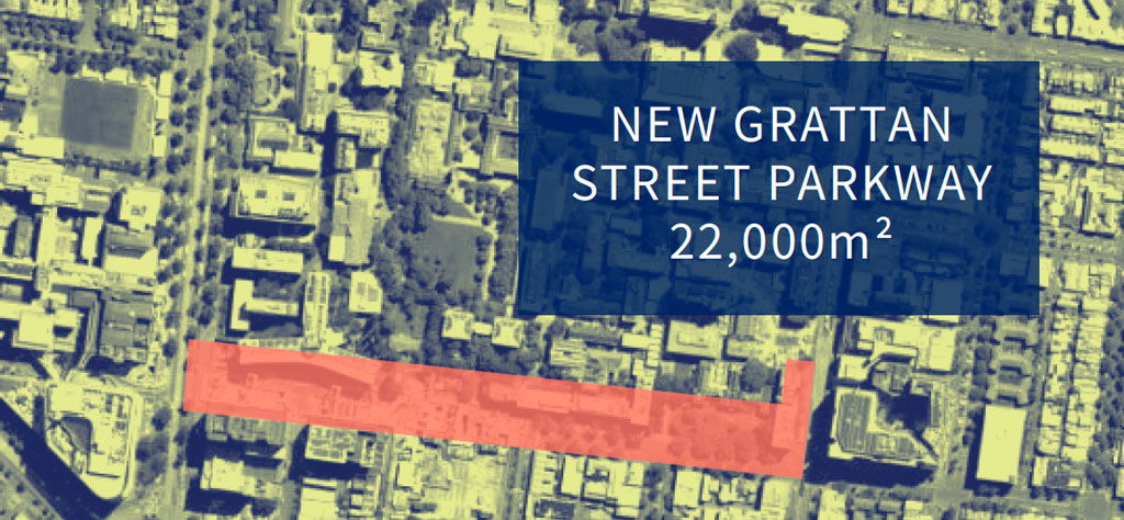
The area is shown in the masterplan as a 35,000 square metre red rectangle running the length of Grattan Street and slightly into Royal Parade. The Southern 17,000 sqm of this land is crown-owned roadway and is being paved right now to a 2018 design for the new station precinct, by the Cross Yarra Partnership. The web page for this precinct estimates that it “will create 3500 square metres of new public space by reconfiguring road space”.

Some rough calcs inform me that the demolished buildings have an approximate combined footprint of 25,000 sqm. Their proposed on-campus replacements take back about 21,000 sqm. The removal of buildings is not creating this green space ( a term without a firm definition ). It’s hard to get anything to add up to 22,000 square metres. The fat green lines running east-west are painted bike lanes – so are sort of green, but I’m assuming that the bulk of balance comes from existing carparks and roads being repurposed as pedestrian walkways and gardens – as suggested by the Jackson master plan in the 2000s.
The new green spaces run continously along the north side of Grattan street, and are formed of pavers and low-planted areas. They are not spaces to stop and rest, to eat lunch or to ponder, they are routes to be traversed. I’ll miss the odd little spaces squirrelled away around the campus, many of which won’t survive. Like the meandering trail from the John Medley building through to the Baillieu Library. People sit sheltered from the wind, bathed in sunlight, surrounded by vegetation, and chomp on their crepes, from a temporary stall that was never removed. It’s a multi-sensory delight. In his 1985 campus history, John Béchervaise called these unexpected moments “inspired grace notes”. Quality trumps quantity.
Let them in
About ninety years ago the university began removing the iron fences marking it as separate from its surrounds. The new plan addresses these concerns again. It will “let the community in”, while making the campus more accessible and safer. 1970s master planner Bryce Mortlock’s intricately woven nooks and crannies, courts and walkways, will become pedestrian boulevards and gardens. Even the famous carpark below the South Lawn will lose its southern wall, letting in the daylight to that dark and precious crypt (and throwing into question the future of The Atlantes portal at the western end).
If the perimeter buildings and their tangled surrounds are cleared, “the community” might feel slightly more inclined to enter and make use of the campus, but the campus remains private property. Step over the boundary and the CCTV cameras are everywhere.
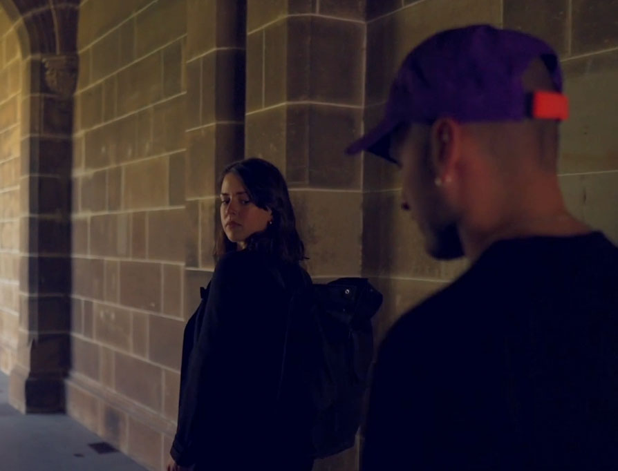 The university has a chirpy video explaining that many cameras are needed to keep your valuables safe from thieves. In a daytime scene in the Old Arts courtyard a well-dressed young woman calls security, to report a man for wearing a purple baseball cap and black t-shirt, for having sculpted facial stubble, ear rings and a necklace. Even though he’s walking away from her. The voiceover warns, “if something doesn’t look or feel right, then it probably isn’t right”. Beware the outsider.
If you’re not convinced by the “letting the community in” talk, it can be read in the reverse – letting the university out. Over the past few decades UoM has been grazing on Carlton. The M.O. – buy several adjoining properties, amalgamate them, put a large box behind historic facades. The unfortunate consequence is that the streets in front of these new buildings are drained of people and activity.
If the community the university is wanting to welcome is not the people living nearby, perhaps it is the community of private companies, who are integral participants in developments south and east of the campus proper. This broader area, known to most as Carlton, is now also called the Melbourne Innovation District (MID).
In “MID City North” plans of 2019 – a partnership between the resident universities and council is envisaged, creating people places with lots of trees, but with its core raison d’être being the commercialisation of post-graduate research.
One of MID’s models is the University of Toronto’s public-private MaRS precinct, which MID documents describe as creating “the chemistry for innovation and commercialisation to flourish.” It’s hard to glean much from the MaRS website, except that it shares MID’s penchant for empty speak: “The work carried out by the innovators in our community is making innovation mean something again”. Critics speaking in plainer language say it’s evolved into a landlord for multinationals. “These foreign companies act as commercial predators—paying market rent, sharing labs and spaces with smaller businesses and start-ups, and then buying them up the moment they show potential.”
University Square
One of these outward pushes has been into University Square, zoned as a Public Park and Recreation Zone, so technically not owned by the university, but it may as well be. Conceived in 1858 as a forecourt to the university’s main gates, the square only began to function this way in the early 2000s after heavy investment into Melbourne University Private. While that didn’t quite come off, the university now controls all the surrounding buildings and installed a plaza on the square, to cap a new underground car park built with Equiset.
Eight years ago a City of Melbourne report described this plaza as “a bleak, uninviting space with failed horticulture”, and a new design is in the process of being implemented (delayed somewhat by the new train line).
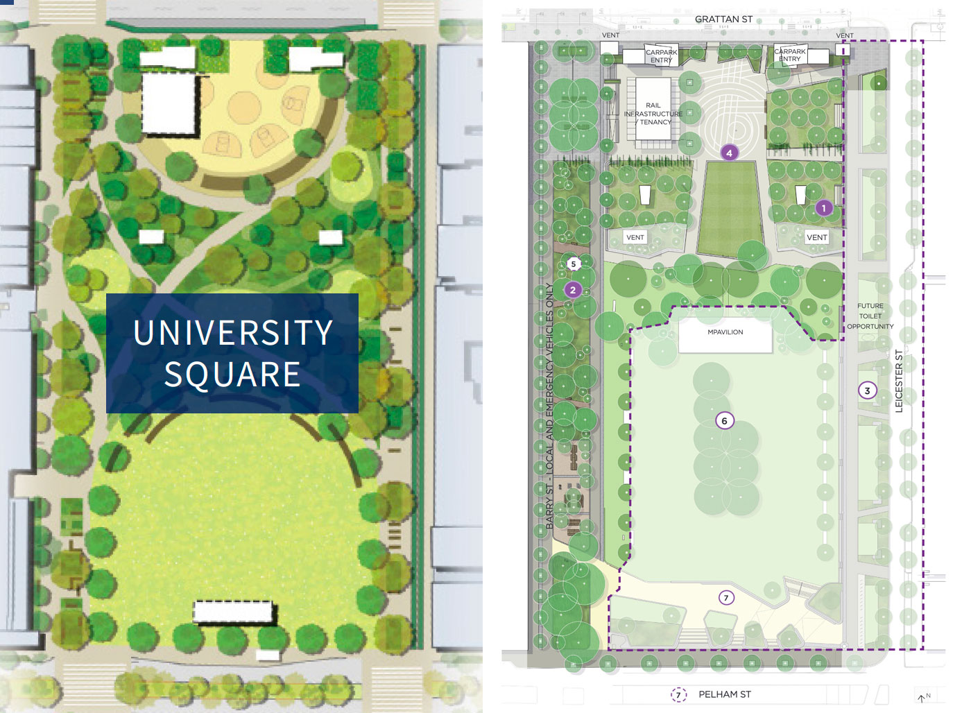
The square features heavily in the university’s new renderings, with a proposed design for the whole square that differs markedly from the council’s current design, which is half built. The university’s plan is for a “softer” space with curving walkways framing a level southern field, terminated by a relocated M Pavilion. Gifted to the university last year, Glenn Murcutt’s 2019 M Pavilion looks a bit lost in the middle of the square, but has to stay until 2032.
The act of overriding the council’s master plan for the square with its own suggests that the university views it as part of its own domain. It could almost be a form of adverse possession.
What’s up? The uni sees the square as one half of a “green campus core as a central park that provides campus continuity to the north and south of Grattan Street”. This continuity is more symbolic than physical, due the trees, level changes, buildings and dog-legs preventing a visual connection between the two spaces.
The council, facing an imminent doubling of the local population, needs the square to do more. As if responding to the university, this has been added to this month’s Master plan refresh.
“University Square is classified as a ‘Neighbourhood open space’ within the City of Melbourne Open Space Strategy 2012. This classification means that the Square should function for “neighbourhood use within walking distance of home with a diversity of character and facilities that appeal to the local community at a neighbourhood level. This means a family or groups of people can visit the park for an extended time, with a suitable range of facilities to meet their different needs.” CoM Master Plan Refresh 2023
The council plan is open for feedback till November 2023.
The buildings
In the numerous strategies and reports publicly released in recent years, there is little to no detailed spatial analysis of the Parkville campus’s built environment. There are a lot of phrases like this: “develop our precincts and campuses to contribute to social, economic and cultural wealth” (2020 annual report). To find any reference to actual buildings and spaces I had to journey back in time to 2008.
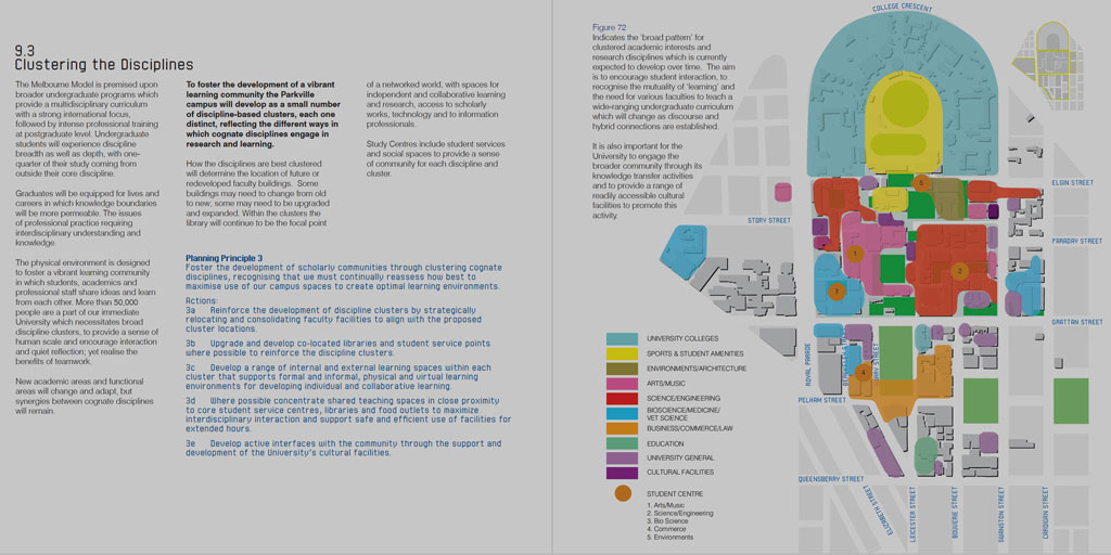
Daryl Jackson’s master plan is a very different sort of document, and seems to be the last one primarily authored by built environment professionals. It is strewn with diagrams and built form analysis, and incorporates several expert reports into heritage, landscape, land use and traffic. You mightn’t agree with it, but it is a legible document, explaining what was intended and why. Much of it came to pass and much of it has found its way into the current plan.
Lovell Chen’s 2005 heritage audit was wound into the document, as a colour-coded map of the campus, with heritage scores. Most of the “red” buildings are either on the current bin list, or have already gone.
The 2023 plan has more buildings on its hit list. If it is was built after WW2 and before 2000, and doesn’t have heritage protection, then it seems it’s fair game.
There is some justification for this. Most of Lovell Chen’s red buildings were built in the post war decades, when Rae Featherstone was the university’s staff architect and campus planner. Education was heavily subsidised or free, and universities built economically to make the most of erratic state grants. After the war, surging student numbers placed even greater pressure on the constrained Parkville site. In 1948, Russell Grimwade suggested terraced multi-storeys as the only way to provide more teaching space where there was a “desperate lack” of land. The next six decades saw an intensive jamming of the Parkville campus, particularly in the southwestern corner, where the medical faculty wanted to shows its face to the new hospital over the road.
Relatively starved of federal government funds, today’s universities scramble to attract post-graduate “talent”, industry partners and fee-paying students. It’s a competitive market, and branding is required to make universities look like more than the sum of their parts. Influence has migrated from semi-autonomous faculties to central administration, with a shift in perceived focus from knowledge to commerce.
Melbourne Uni’s “brand image” pushes its “world class” status – it is both historic and state of the art, conservative and innovative. For brand consistency, it requires buildings that are either historically significant or state of the art modern. A cream brick post war building mightn’t fit the brand, and might sit awkwardly on the site, but there are other factors that need considering. A big one is sustainability. On this front, the worst case outcome is demolition.
Green stars
The university is keen to boast of its leadership in sustainability. There is not much that’s publicly available to support this claim, but there is a wealth of reports saying that they’re doing better than they’d hoped. The university’s Sustainability Plan 2030 has this statement at its heart.
“Global values and actions must be ecologically sound, socially just and economically viable, with success in one area not coming at the expense of the others.”
Triple bottom line mantra offers an easy out for business as usual. If a sustainability initiative isn’t cost neutral, or will only make a profit in the long term, then it may just have to wait. And how are ecological and social expenses measured exactly?
On the construction front, the Sustainability Plan 2030 outsources sustainability to Green Star. This certification system’s linear life cycle assessments and upfront carbon counts don’t cater well to projects involving the replacement of an existing building. Measurements focus on the life of the new building. The high carbon costs of an existing building’s demolition and disposal aren’t really accounted for – you might get a credit for reusing part of a building or non-landfill disposal but there is no real penalty for nuking it.
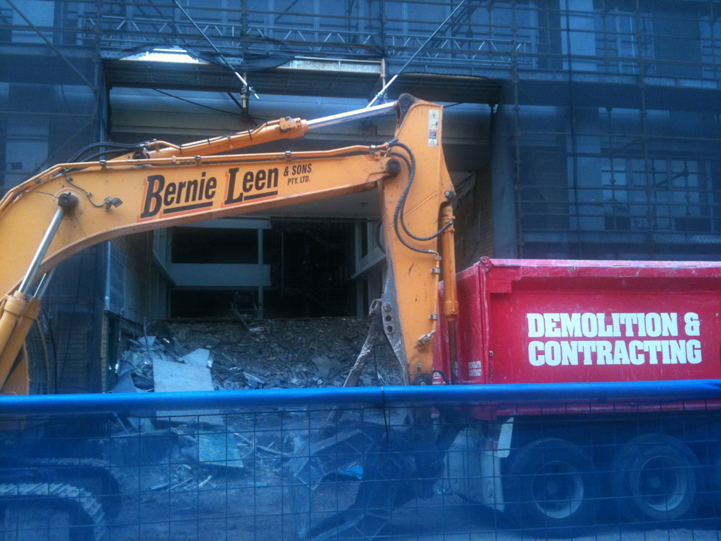
“Emissions from demolishing a previous building and clearing the site of rubble are part of the previous building’s life cycle.” GBCA Upfront Carbon Emissions calculation
“References to the demolition process in the Upfront Carbon Emissions calculation guide will be removed in the next revision.” GBCA FAQ”, August 2023.
Thus, in the university’s 2022 emissions report, all demolition and contruction waste is excluded.
There are problems integrating demolition into upfront calculations – the replacement building might not even be on the same site – but omitting it across the board lets owners and developers off the hook. Demolition is guilt-free. Change is afoot in the U.K., but in Australia there has been little discussion or consideration since a brief flurry in the 2000s.
Some of the death row buildings at the university will be replaced by grass and plants, excluding them from Green Star despite red star behaviour. There is no disincentive for bulldozing a 23 year old award-winning building and replacing it with granitic sand.
There are auditing tools that could be used to determine an existing building’s suitability for adaptive reuse (or demolition). They are virtually unheard of, and don’t have industry backing, but could be part of the decision-making process on a campus-wide project like this. Buildings shouldn’t be torn down just because they are unfashionable, or because they are in the way of current aspirations. I don’t think we have that luxury any more.
Despite the increased efforts of demolition companies to recycle, 43% of Australia’s 74,100,000 tonnes of waste in 2018-2019 was from construction and demolition. It has been growing steadily year by year.
A starting point for the master planners could be explaining why each of the buildings listed below cannot be preserved, and how ecological damage will be minimised in their demolitions.
Buildings tagged for demolition
The plan’s renderings show the removal of many buildings. A few of these buildings are mentioned elsewhere as being under review, so it may all be rather fluid.
Following are the “retirements” as shown in the renderings and one pixellated plan. It is a work in progress. I’m only listing the buildings and structures, generally leaving out for now the landscapes and integrated artworks that might disappear with them.
Contrasting opinions and stray facts are sourced mostly from:
- 1985’s The University of Melbourne : an illustrated perspective, John Mayston Béchervaise
- 2003 Philip Goad and George Tibbits’ “Architecture on Campus: A guide to Melbourne University and its colleges”.
- 2004 Stuart Macintire and R.J.W. Selleck’s “A Short History of the University of Melbourne”.
- 2008 Daryl Jackson’s master plan
- 2013, Charles Sowerwine, chair of the heritage committee at the Royal Historical Society of Victoria, and Professor Emeritus at the university’s Faculty of Arts wrote a booklet describing the Parkville campus for visiting academics.
- University of Melbourne key research guides
- Cross Section archives
The photos are all my own unless noted, taken 2012-2023.
NORTHERN
Redmond Barry building
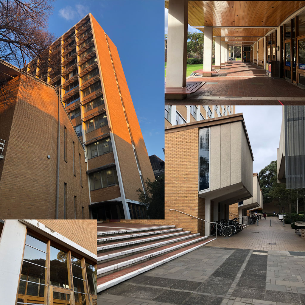
1959-61, Rae Featherstone (1907-1987) with Eggleston MacDonald & Secomb
A 12 storey landmark visible for miles down Elgin Street, this building works best at ground level, with a scallop-roofed concourse runs along the northern side facing onto a sculpture garden. Along the southern face, teaching spaces cantilever out playfully.
Lovell Chen, in their 2005 report, determined the building to have “potential heritage value”, but tagged it for redevelopment due to its poor condition. Since then its condition has deteriorated further due to a lack of remediation of the external skin and junctions.
Charles Sowerwine described this building as “an undistinguished high-rise building in pale orange brick with vertical concrete banding”. Selleck and Macintyre thought it looked cheap, and was a “remarkable affront to the classical taste of its namesake”.
Goad and Tippet note of this building (and the other Featherstone buildings) that there was “care taken in the detail and treatment of the ground level undercroft and lobby spaces, and also the adjacent landscapes… a measure in many respects of the quietly humane architecture of Featherstone”.
Raymond Priestley administrative building (formerly North building)
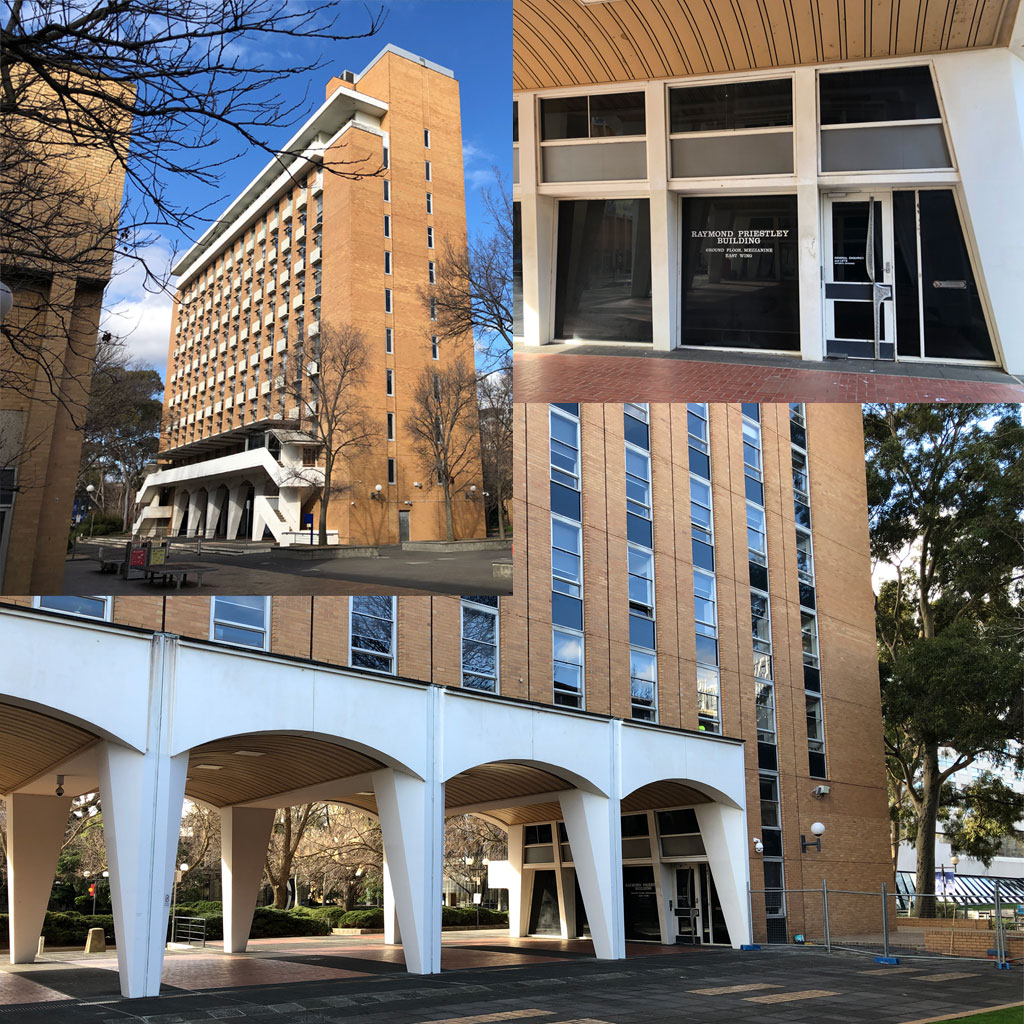
1967-70, Douglas Alexandra (1922-2000) and Raymond Berg (1913-1989) in association with Rae Featherstone.
Once again, opinions are mixed. Selleck and Macintyre thought the way this building cut the connection between Wilson Hall and Priestley’s “beloved” Union was inappropriate, and that the undercroft with its distinctive piloti served no purpose other than to buffet passersby. Lovell Chen, in their 2005 report, determined the building to have “potential heritage value”.
The masterplan would like to extend Masson road through this building. Masson Road was once an important entry point to the university, but not since Public Transport Victoria decided, in their wisdom, to place a block long tram waiting area at the Swanston Street end.
Southern edge of North Lawn (formerly Union Lawn)
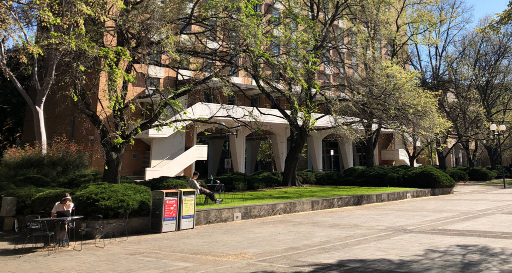
Once a marsh, then dammed into an ornamental lake, then filled in 1939, the “concrete lawn” has been noticeably quieter since the student union was relocated (some might say sidelined) to the southwestern quadrant. The replacement admin building would sit along this edge of this square.
Union House & Theatre
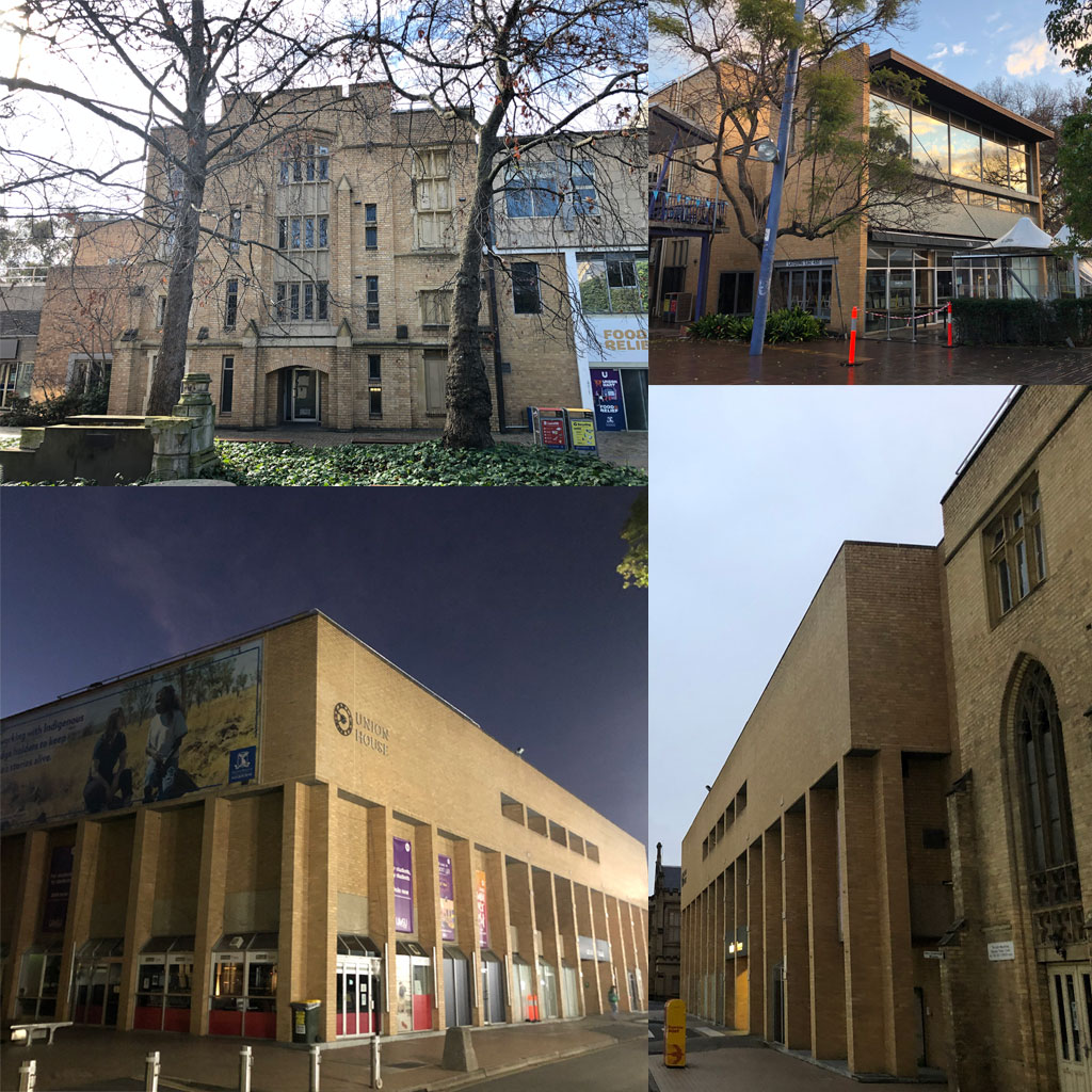
1863 Reed and Barnes (as the National Museum), 1938 Philip Hudson, 1966 Rae Featherstone, 1964-1980 Eggleston MacDonald & Secomb, 1987-97 Peter Elliott, 1995-98 Bates Smart.
This is an assemblage of buildings responding to their times, less than the sum of its parts but of cultural significance. Vacated recently, most student functions have been moved to the South Eastern quadrant and split up. A remnant of the northern wing of the old museum still faces onto the North Lawn.
In 2005 Lovell Chen determined the buildings to have “moderate heritage value”.
Beaurepaire Centre (far western end) 1957
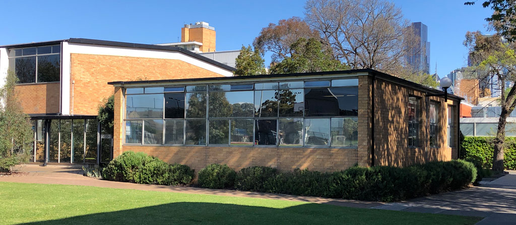
The boxy western annex was excluded from the Beaurepaire’s heritage listing.
Biosciences 4 (147, behind the Granger Museum)
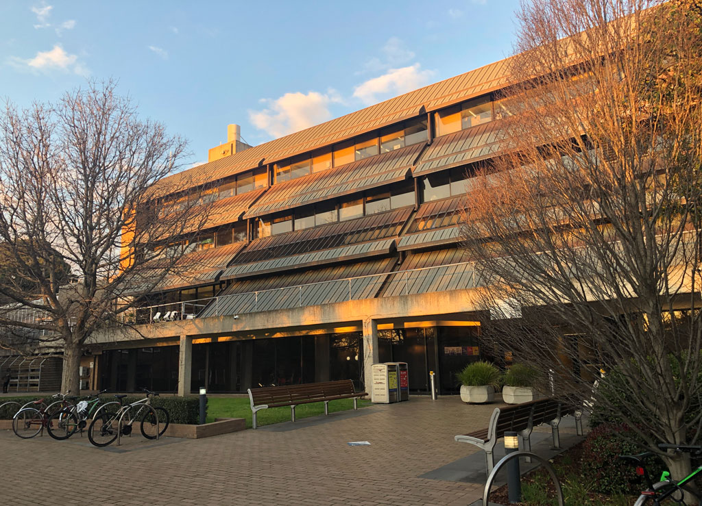
An elegant receding plane backdrop to the Grainger museum, with a handy link way through the guts of it. The glass houses at the northern end of this building are also to be razed, with that land to be returned to the System Garden, replacing land taken by the new Botany building.
Sowerwine says, “a more modern but no less mediocre version of the University’s 1960s yellow-brick buildings”.
THE SOUTH
John Medley gateway building
1971, Grounds, Roy and Co. Pty.Ltd.
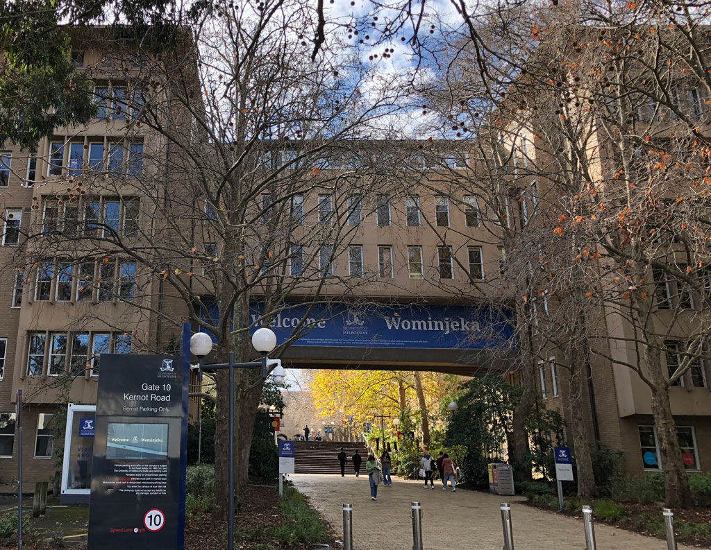
These modernist medieval towers are looked upon fondly by tenants I’ve spoken to over the years, though there are reservations about the teaching spaces. It’s a bold gateway building that is running into trouble now that the university doesn’t want a castle wall.
With its removal, the very special ’70s space that is the South Lawn will lose its southern enclosure – The John Medley Building has just the right posture and height in this role.
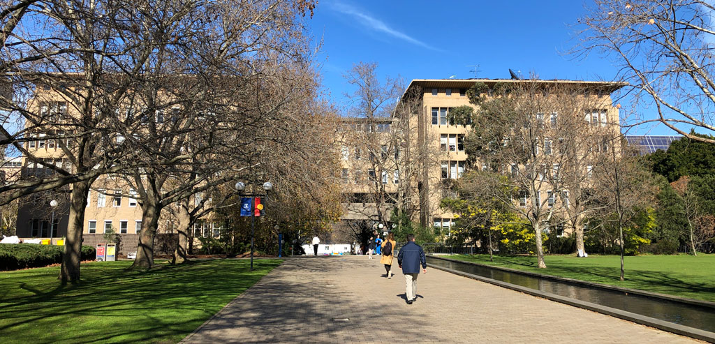
In “Estate Needs”, this building is subject to an efficiency study, not demolition. This may already have happened, as it was recently refurbished to shrink all the offices, with the disposal of much of its original cabinetry and furniture, often into skips.
In its article The Age sought input on the building’s architectural value from Charles Sowerwine. He thought the John Medley building “rather pedestrian”, due to Grounds’ original bluestone cladding being value managed out. In his 2013 booklet he informed visitors that, “unfortunately, his design met opposition, which led to the less adventurous building you see before you”.
Lovell Chen, in their 2005 report, thought the building had “high heritage value”. It was added to the AIA’s Register of Twentieth Century Architecture in 2019.
Main entrance gates and fencing
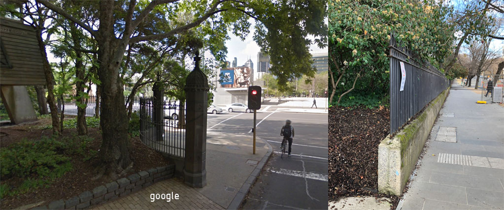
1876, Reed & Barnes
Galvanised gates, pillars and fencing. This has a heritage registration but has been temporarily removed for the train works. The renderings do not show their return.
SOUTH EAST
Old Metallurgy Building ( 166 )
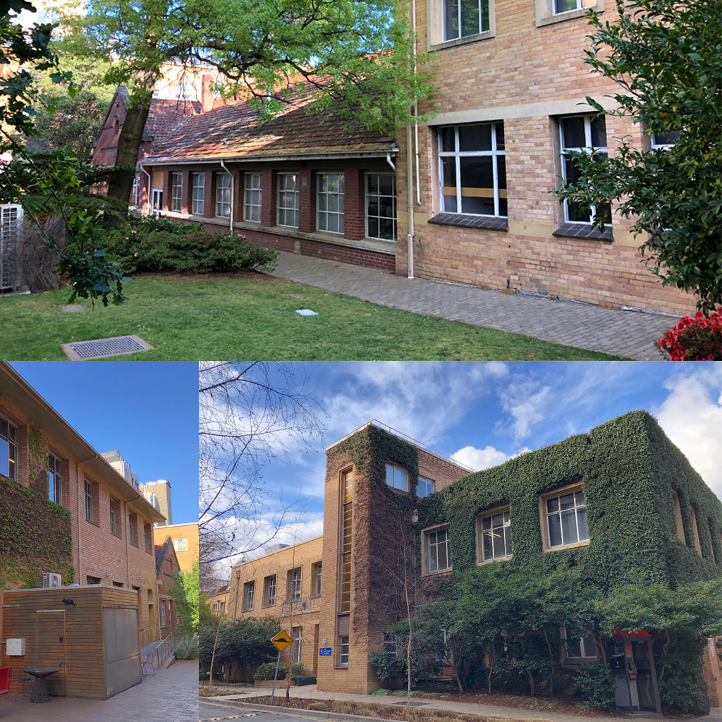
Built in the 1930s, this is one of few pre-war buildings that appears to be going. Deemed “end-of-life” the building and rear workshops will be replaced by the NeXT wet lab building, a “new multi-disciplinary research hub for materials engineering and bioengineering that promotes cross-faculty research and collaboration with industry partners.”
Chemical Engineering 2 ( 167 )
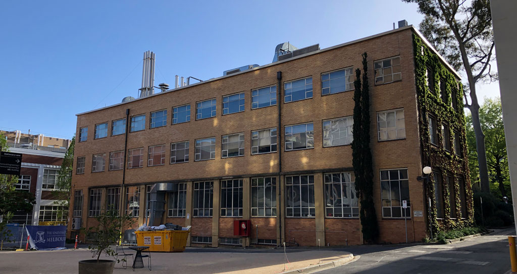
Approx 1962 with numerous renovations through to 1991.
Mechanical Engineering building
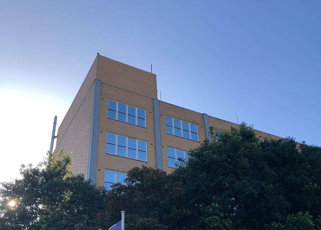
c.1960s?
A tall cream brick, hidden in the trees next to the 1888 building.
757 Swanston – “Stop 1” Academic Services (199)
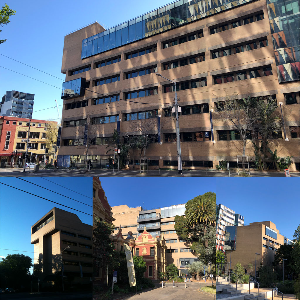
p(emph—sm)? 1970; Six Degrees 2012, 2018
Built as part of the Teachers’ College as the “Arts Centre” this monolith, with its distinctive “Ned Kelly” southern facade, was valued in Mortlock’s 1991 master plan but savaged in Jackson’s 2008 plan, which said it “severely blights” the corner of Grattan and Swanston. The buildings was heavily refurbished by Six Degrees (who called it an “undervalued 1970s Brutalist architectural gem”) for $19M just 5 years ago.
Engineering workshops C ( 174 )
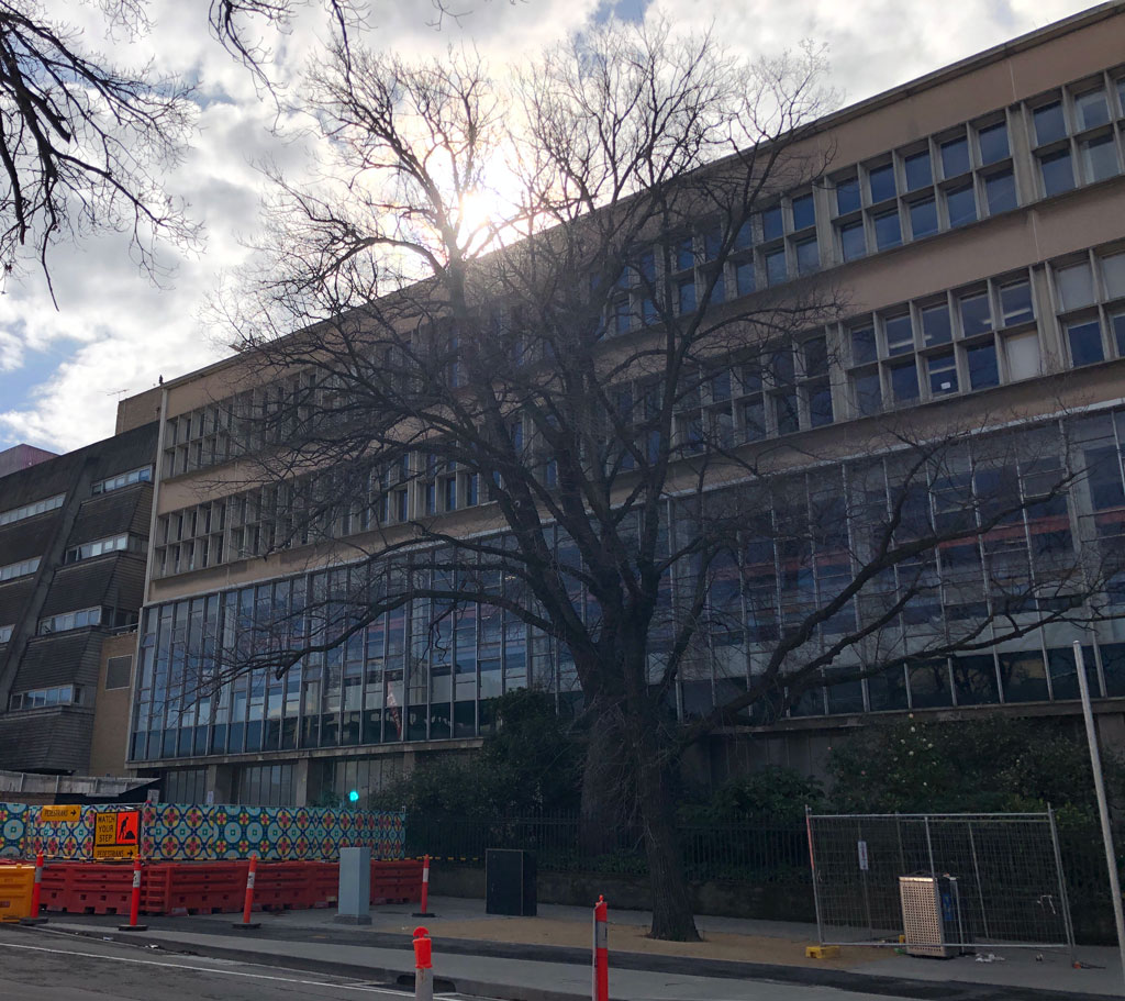
c.1960?
A solid old thing, pushed into obsolescence by the move to Fisherman’s Bend of “making” faculties.
Engineering buildings B & D ( 175, 176 )
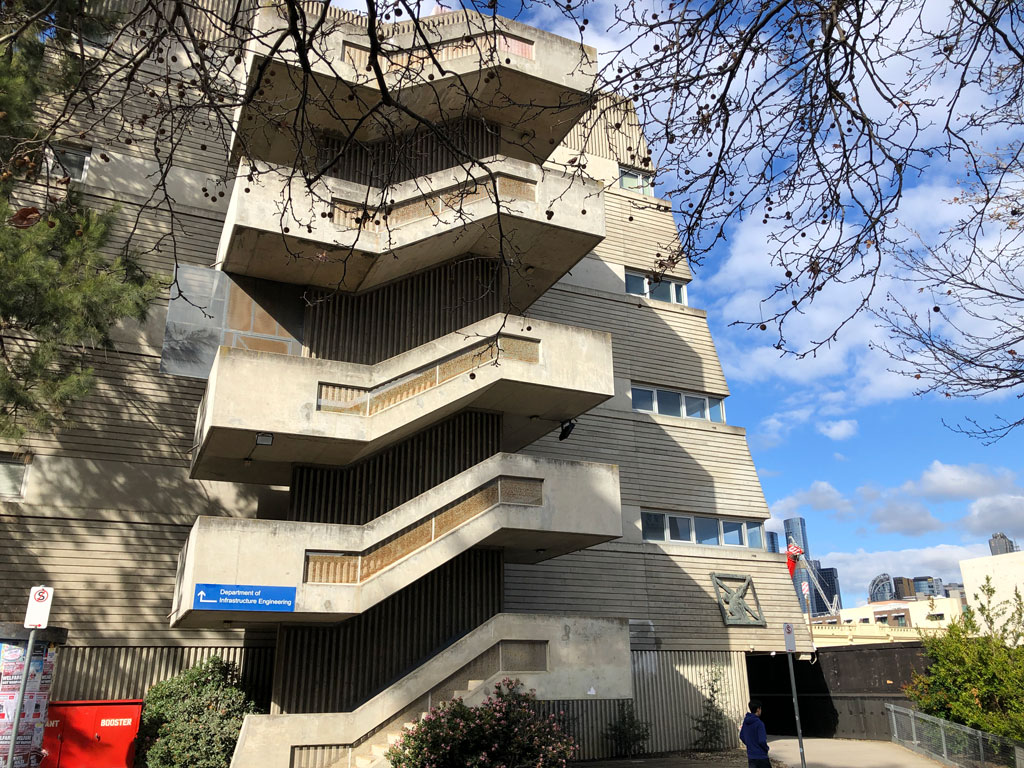
1973-1974 Civil and Civic
The sloping off-cast extensions to the C building were a product of the 1970 masterplan, which promoted a space-maximising external wall of buildings, relieved by inner courts where older buildings were to be (but weren’t) demolished.
Béchervaise loved these additions back to front. He waxes over the gruelling briefs, off-formed stepped façades, acoustic double-glazing, immense buttresses and the external western staircase. These buildings tried hard and it worked.
Sowerwine wrote about these buildings that they were, “planted right on the footpath because the master plan in force until 1971, inspired by modernism, called for a wall of such buildings around the perimeter of the campus”.
SOUTH WEST
This is currently a dense precinct of medical buildings built in a hurry in the 1950s and ’60s, after the medical faculty lobbied for a move from the northeastern to southwestern corner of the Parkville campus. The Royal Melbourne Hospital had relocated from the city to this corner of Parkville in 1944, taking over the pig market site.
Goad and Tippetts wrote that these buildings were quite different from their architects other work, exhibiting a “studied neutrality” with “rigorously modulated structure and repetitive façades.”
The intensification of the southwestern corner continued in the Nineties and 2000s as car parks and undercrofts were turned into more gross floor area.
Medical building 181
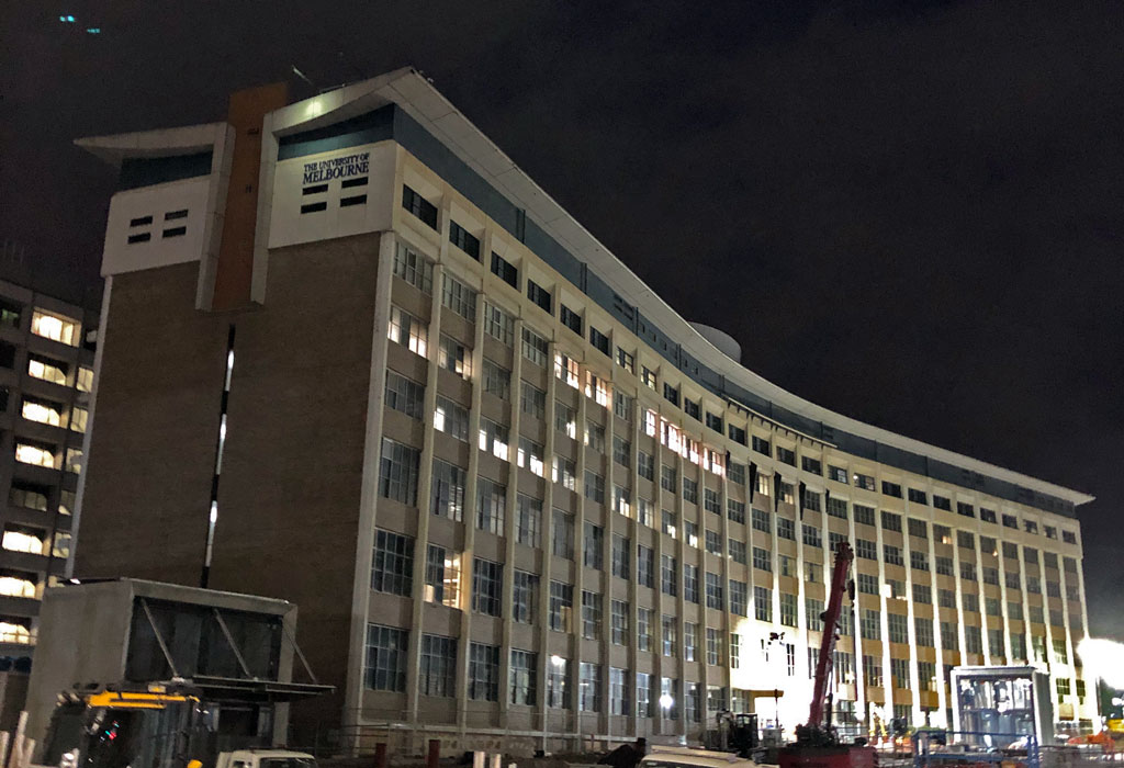
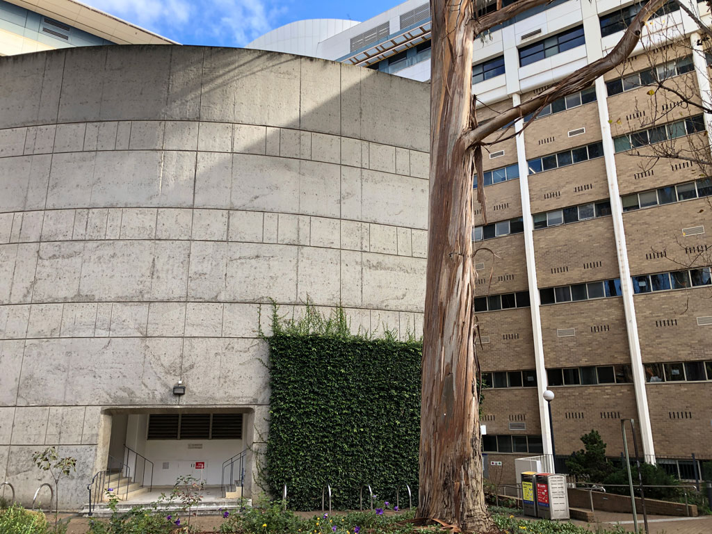
1968, 1996-97 (Castle, Stevenson and Turner)
A great tripartite pinwheel of a building lodged into the corner of the campus proper. In 2005 Lovell Chen determined that the building had “potential heritage value”. At the time, Cross Section thought the building (which looked nothing like it does now) had very little going for it, mainly because it didn’t align with its neighbours.
Howard Florey Institute 183
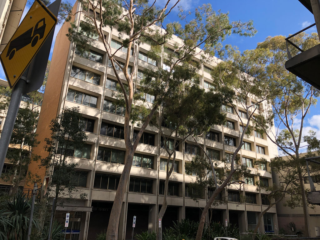
1959-1963, 1975 Yuncken Freeman, Griffiths and Simpson. 1993-1996
The Florey was added to the AIA Vicoria’s Register of Twentieth Century Architecture in 2019.
Eels have been spotted in the water garden to the immediate north, an area also hosting some giant Eucalypts.
Microbiology building 184, 1965
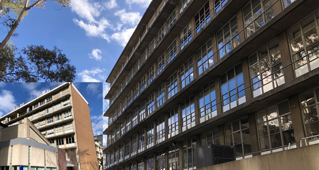
1962-1964 Romberg and Boyd, 2000 Sainsbury Reed Group
Not the loveliest of buildings now, this sooty concrete edifice is hemmed into its site. It once featured a hovering cantilevered lecture theatre, plugged in a few years ago. In the early 2010s the neighbouring Brain Centre was built almost right up against it – perhaps assuming it wouldn’t be around for long.
Deemed by Lovell Chen in 2005 to be in poor condition and ripe for new development.
Browness Biomedical library 182
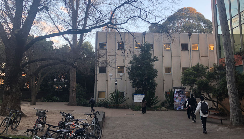
1967 John Scarborough and Partners, 2010 McBride Charles Ryan full refit, 2017 L2 refurbishment.
Its polar station exterior hides within it some unexpectedly generous student spaces, along with the Medical History Museum and Health Hub.
It is rumoured to be closing in 2024.
The masterplans
The University has many masterplans, formal and not so.
- 1937 Building sub-committee formed for building planning (Eggleston and Serpell)
- 1945 Scarborough (architect) and Summers (geologist)
- 1949 architect Bryan Lewis
- 1957-1972 Rae Featherstone, staff architect and campus planner Built Heritage
- 1971, 1981 Bryce Mortlock
- 1991 Bryce Mortlock with assistance from Peter Elliott
- 2000, 2008 Daryl Jackson built- promoting pushes to east and west. Curiously the Jackson masterplans are omitted in the 2023 plan’s history of past plans, which states that there hasn’t been a comprehensive plan for 30 years. It’s also the last plan written by an architect. Jackson’s plan introduced ESD, following the university’s 2002 commitment to the Talliores Declaration.
- 2017 OC21. “Our Campus in the 21st Century”. Responding to the “Growing Esteem” stratgeic plan (2005, 2010, 2015), this master plan is not about the built environment, except as an enabler of excellence (or somesuch). “The logic behind a traditional master plan is no longer enough to facilitate and respond to rapid change. It is the synergy between small interventions and larger scale buildings that ensures high quality experiences.” This framework advocates for more green space and “friendly openings” between buildings, but calls buildings “passive”, unlike new fangled things like wifi and media-rich whatsit.
- 2018 Estate plan, by the VC and COO. Established an Estate Planning Group and Design Advisory Review Panel.
- 2020 – Advancing Melbourne strategic framework 2020-2030
In its “Place” section, this paper discusses the university’s built environment very loosely. It says it will foster reconciliation, make precincts to attract the “most brilliant minds” and will aspire to be a sustainability leader.
- 2022 Estate needs. 70 “needs” were identified in 2022 – it is not clear how. At Parkville this exercise teased out “themes of creating a holistic campus experience, respecting heritage and culture, and enhancing campus and precinct cohesion”.
- 2023 Estate Master Plan. This plan was developed from Advancing Melbourne’s airy aspirations, and the Estate Needs exercise.
comment
Thanks Peter for compiling a clear and thorough overview of Melbourne University plans, building issues and history. Generous and thoughtful of you to lead the discussion and encourage productive open evidence based debate.
by KRISTIN GREEN on 27/10/23 ·#
Thanks for putting all of this together.
I have not read all the detail yet, but I will.
I feel physically sick at the thought that buildings like the Raymond Priestley building,
Redmond Barry building and (part of) the Beaurepaire Centre are on the list.
Look at them – they are MAGNIFICENT.
Most (all?) of the buildings on the list have merit. Sure – they may need to be refitted and adapted, but surely an institution like Melb Uni can lead the way?
I cannot understand why yellow brick architecture is unfashionable (as heritage overlays fail to consider yellow brick suburbia to be “heritage”, and ugly buildings have no value.
Sometimes worth is not immediately apparent. For example: the old Architecture building was a truly stylistically challenged building, however it had some of the most exquiste internal planning I’ve seen. Not to mention the efficiency that allowed 2 extra levels to be built for the budget.
Will stop writing from my hear and read your whole article.
by Kirsty Fletcher on 29/10/23 ·#
Commenting is closed for this article.
